This is an article to serve as a guide in terms of styling a radio group into a group of Tabs. This is only a guide or reference which was applied for one client but would need adapting to match the colors or style the next client wants.
Why?
The scenario is that my client has quite a long Creator form and instead of scrolling down while entering data, they would prefer if they could have tabs along the top to display each section.
How?
The way we do this is by applying our own stylesheet and overriding certain CSS elements that the vanilla or out-of-the-box Zoho Creator ones provide.
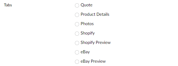
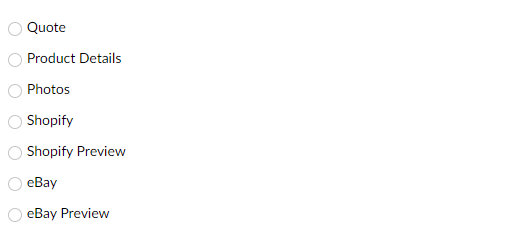
First, let's add a Notes field to the Creator form, I'm calling mine Note_CSS, then I have added a radio group called Tabs [NB: If you rename it from "Tabs" to something else, all CSS references need to be changed as well to the new name and follow the syntax .zc-NewName-group{}].
What I have (Original)
I want to run some deluge (snippets below) every time the form loads, so I
- Go to Workflows > Form Workflows > Select your form
- Click on New Workflow
- Choose form (the one your radio tabs group exists on)
- (Record Event) Run when a record is Created or Edited
- (Form Event) When to trigger workflow Load of the form
- Name the workflow, I'm calling mine OnLoad
- Add New Action > Deluge Script:
copyraw
Yieldsv_Css = "<style>";
v_Css = v_Css + ".zc-Tabs-label{display:none !important;}";
v_Css = v_Css + "</style>";
input.Note_CSS = v_Css;
- v_Css = "<style>";
- v_Css = v_Css + ".zc-Tabs-label{display:none !important;}";
- v_Css = v_Css + "</style>";
- input.Note_CSS = v_Css;
Then aligning these radio options horizontally:
copyraw
Yieldsv_Css = "<style>";
v_Css = v_Css + ".zc-Tabs-label{display:none !important;}";
v_Css = v_Css + ".zc-Tabs-group .choice-table-row{display:inline-block !important;padding:0;}";
v_Css = v_Css + "</style>";
input.Note_CSS = v_Css;
- v_Css = "<style>";
- v_Css = v_Css + ".zc-Tabs-label{display:none !important;}";
- v_Css = v_Css + ".zc-Tabs-group .choice-table-row{display:inline-block !important;padding:0;}";
- v_Css = v_Css + "</style>";
- input.Note_CSS = v_Css;

Then I need to get rid of the circles (radio inputs) but ensure the labels are still visible (I can hide all labels in this group except for those with class "choice-label-text"):
copyraw
Yieldsv_Css = "<style>";
v_Css = v_Css + ".zc-Tabs-group label{display:none !important;}";
v_Css = v_Css + ".zc-Tabs-group label.choice-label-text{display:block !important;}";
v_Css = v_Css + ".zc-Tabs-group .choice-table-row{display:inline-block !important;padding:0;}";
v_Css = v_Css + "</style>";
input.Note_CSS = v_Css;
- v_Css = "<style>";
- v_Css = v_Css + ".zc-Tabs-group label{display:none !important;}";
- v_Css = v_Css + ".zc-Tabs-group label.choice-label-text{display:block !important;}";
- v_Css = v_Css + ".zc-Tabs-group .choice-table-row{display:inline-block !important;padding:0;}";
- v_Css = v_Css + "</style>";
- input.Note_CSS = v_Css;
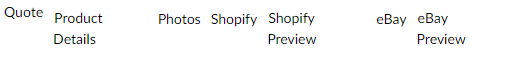
And for the penultimate bit of CSS just to style the tabs into tabs:
copyraw
Yields// start the CSS stylesheet
v_Css = "<style>";
// align radio options horizontally
v_Css = v_Css + ".zc-Tabs-group .choice-table-row{display:inline-block !important;padding:0;}";
// fix internal padding ("Quote" was higher then other radio options)
v_Css = v_Css + ".zc-Tabs-group .choice-table-cell{padding:0 !important;}";
// hide all labels
v_Css = v_Css + ".zc-Tabs-group label{display:none !important;}";
// make labels with class choice-label-text visible and style with border, text alignment and background
v_Css = v_Css + ".zc-Tabs-group label.choice-label-text{display:block !important;width:125px;padding:5px;border:1px solid #eee;text-align:center;}";
v_Css = v_Css + ".zc-Tabs-group label.choice-label-text{background: linear-gradient(#fefefe, #efefef);border-bottom:1px solid #eee;}";
// make labels have rounded top-left corners
v_Css = v_Css + ".zc-Tabs-group label.choice-label-text{-webkit-border-top-left-radius: 5px;-moz-border-radius-topleft: 5px;border-top-left-radius: 5px;}";
// make labels have rounded top-right corners
v_Css = v_Css + ".zc-Tabs-group label.choice-label-text{-webkit-border-top-right-radius: 5px;-moz-border-radius-topright: 5px;border-top-right-radius: 5px;}";
// add a background gradient for when the mouse hovers over these
v_Css = v_Css + ".zc-Tabs-group label.choice-label-text:hover{color:#fff;background: linear-gradient(#006f3d, #ff0);}";
// end the CSS stylesheet
v_Css = v_Css + "</style>";
// write this stylesheet to the note CSS
input.Note_CSS = v_Css;
- // start the CSS stylesheet
- v_Css = "<style>";
- // align radio options horizontally
- v_Css = v_Css + ".zc-Tabs-group .choice-table-row{display:inline-block !important;padding:0;}";
- // fix internal padding ("Quote" was higher then other radio options)
- v_Css = v_Css + ".zc-Tabs-group .choice-table-cell{padding:0 !important;}";
- // hide all labels
- v_Css = v_Css + ".zc-Tabs-group label{display:none !important;}";
- // make labels with class choice-label-text visible and style with border, text alignment and background
- v_Css = v_Css + ".zc-Tabs-group label.choice-label-text{display:block !important;width:125px;padding:5px;border:1px solid #eee;text-align:center;}";
- v_Css = v_Css + ".zc-Tabs-group label.choice-label-text{background: linear-gradient(#fefefe, #efefef);border-bottom:1px solid #eee;}";
- // make labels have rounded top-left corners
- v_Css = v_Css + ".zc-Tabs-group label.choice-label-text{-webkit-border-top-left-radius: 5px;-moz-border-radius-topleft: 5px;border-top-left-radius: 5px;}";
- // make labels have rounded top-right corners
- v_Css = v_Css + ".zc-Tabs-group label.choice-label-text{-webkit-border-top-right-radius: 5px;-moz-border-radius-topright: 5px;border-top-right-radius: 5px;}";
- // add a background gradient for when the mouse hovers over these
- v_Css = v_Css + ".zc-Tabs-group label.choice-label-text:hover{color:#fff;background: linear-gradient(#006f3d, #ff0);}";
- // end the CSS stylesheet
- v_Css = v_Css + "</style>";
- // write this stylesheet to the note CSS
- input.Note_CSS = v_Css;

All of me
Now we have the tabs looking close to what we want, you will have noted that I have done this code in-line of the form. If you were to embed the form on to a page, you would be free to use some reserved CSS attributes on the page style rather such as position: absolute. Because I'm doing this inline and via code, Zoho automatically removes these. So instead, I am going to use negative/positive margins to move the tabs group up/down along with the form wrapper (so all the form is below the tabs group) and then a negative margin on another notes field called Note_Title which contains my header to place it above the tabs group:
copyraw
v_Css = "<style>";
v_Css = v_Css + ".zc-Tabs-group .choice-table-row{display:inline-block !important;padding:0;}";
v_Css = v_Css + ".zc-Tabs-group .choice-table-cell{padding:0 !important;}";
v_Css = v_Css + ".zc-Tabs-group label{display:none !important;}";
v_Css = v_Css + ".zc-Tabs-group label.choice-label-text{display:block !important;width:125px;padding:5px;border:1px solid #eee;text-align:center;}";
v_Css = v_Css + ".zc-Tabs-group label.choice-label-text{background: linear-gradient(#fefefe, #efefef);border-bottom:1px solid #eee;}";
v_Css = v_Css + ".zc-Tabs-group label.choice-label-text{-webkit-border-top-left-radius: 5px;-moz-border-radius-topleft: 5px;border-top-left-radius: 5px;}";
v_Css = v_Css + ".zc-Tabs-group label.choice-label-text{-webkit-border-top-right-radius: 5px;-moz-border-radius-topright: 5px;border-top-right-radius: 5px;}";
v_Css = v_Css + ".zc-Tabs-group label.choice-label-text:hover{color:#fff;background: linear-gradient(#006f3d, #ff0);}";
// tabs group positioning
v_Css = v_Css + ".zc-Tabs-group{margin-bottom:0;margin-top: -103px;}";
// styling the form wrapper to look like a tab panel
v_Css = v_Css + ".zc-form-scroll-wrapper{padding:20px;border:1px solid #eee;margin-top:100px;}";
// move the note field called Note_Title to above the tabs group
v_Css = v_Css + "div[name='Note_Title']{margin-top:-130px;}";
v_Css = v_Css + "</style>";
input.Note_CSS = v_Css;
- v_Css = "<style>";
- v_Css = v_Css + ".zc-Tabs-group .choice-table-row{display:inline-block !important;padding:0;}";
- v_Css = v_Css + ".zc-Tabs-group .choice-table-cell{padding:0 !important;}";
- v_Css = v_Css + ".zc-Tabs-group label{display:none !important;}";
- v_Css = v_Css + ".zc-Tabs-group label.choice-label-text{display:block !important;width:125px;padding:5px;border:1px solid #eee;text-align:center;}";
- v_Css = v_Css + ".zc-Tabs-group label.choice-label-text{background: linear-gradient(#fefefe, #efefef);border-bottom:1px solid #eee;}";
- v_Css = v_Css + ".zc-Tabs-group label.choice-label-text{-webkit-border-top-left-radius: 5px;-moz-border-radius-topleft: 5px;border-top-left-radius: 5px;}";
- v_Css = v_Css + ".zc-Tabs-group label.choice-label-text{-webkit-border-top-right-radius: 5px;-moz-border-radius-topright: 5px;border-top-right-radius: 5px;}";
- v_Css = v_Css + ".zc-Tabs-group label.choice-label-text:hover{color:#fff;background: linear-gradient(#006f3d, #ff0);}";
- // tabs group positioning
- v_Css = v_Css + ".zc-Tabs-group{margin-bottom:0;margin-top: -103px;}";
- // styling the form wrapper to look like a tab panel
- v_Css = v_Css + ".zc-form-scroll-wrapper{padding:20px;border:1px solid #eee;margin-top:100px;}";
- // move the note field called Note_Title to above the tabs group
- v_Css = v_Css + "div[name='Note_Title']{margin-top:-130px;}";
- v_Css = v_Css + "</style>";
- input.Note_CSS = v_Css;
Functionality
Great! And to add some functionality, in other words, have tabs show/hide when a radio option is clicked on, I need to
- Go to Workflows > Form Workflows > Select your form
- Click on New Workflow
- Choose form (the one your radio tabs group exists on)
- (Record Event) Run when a record is Created or Edited
- (Form Event) When to trigger workflow User input of a field
- Choose Field Tabs (or whatever you named your tabs radio field)
- Name the workflow, I'm calling mine OnUserInput_Tabs
- Add New Action > Deluge Script:
copyraw
// assuming my sections are called "Tab_Section_1", and so on ... [these can be named as you want, the names I've used here are for demo purposes] hide Tab_Section_1; hide Tab_Section_2; hide Tab_Section_3; hide Tab_Section_4; hide Tab_Section_5; hide Tab_Section_6; hide Tab_Section_7; // if(isNull(input.Tabs) || input.Tabs == "Quote") { show Tab_Section_1; } else if(input.Tabs == "Product Details") { show Tab_Section_2; } else if(input.Tabs == "Photos") { show Tab_Section_3; } else if(input.Tabs == "Shopify") { show Tab_Section_4; } else if(input.Tabs == "Shopify Preview") { show Tab_Section_5; } else if(input.Tabs == "eBay") { show Tab_Section_6; } else if(input.Tabs == "eBay Preview") { show Tab_Section_7; } else { show Tab_Section_1; }- // assuming my sections are called "Tab_Section_1", and so on ... [these can be named as you want, the names I've used here are for demo purposes]
- hide Tab_Section_1;
- hide Tab_Section_2;
- hide Tab_Section_3;
- hide Tab_Section_4;
- hide Tab_Section_5;
- hide Tab_Section_6;
- hide Tab_Section_7;
- //
- if(isNull(input.Tabs) || input.Tabs == "Quote")
- {
- show Tab_Section_1;
- }
- else if(input.Tabs == "Product Details")
- {
- show Tab_Section_2;
- }
- else if(input.Tabs == "Photos")
- {
- show Tab_Section_3;
- }
- else if(input.Tabs == "Shopify")
- {
- show Tab_Section_4;
- }
- else if(input.Tabs == "Shopify Preview")
- {
- show Tab_Section_5;
- }
- else if(input.Tabs == "eBay")
- {
- show Tab_Section_6;
- }
- else if(input.Tabs == "eBay Preview")
- {
- show Tab_Section_7;
- }
- else
- {
- show Tab_Section_1;
- }
- Done! Well almost
Set Clicked Tab to Selected
One niggling issue I had was that when selecting a tab, the selected tab didn't stay a different color or style. One theoretical way around this could be that I restyle the "::after checked", hide the circle line and somehow style the inner dot to overlay or serve as background on the tab.
But that was a bit too much CSS for my head so instead, I'm going to add yet another notes field in my form called Note_TabCSS and modify the above workflow (OnUserInput_Tabs) to something like the following:
copyraw
And I'd also have to add some code to the OnLoad workflow I created earlier which defaults this to perhaps the first tab:
hide Tab_Section_1;
hide Tab_Section_2;
hide Tab_Section_3;
hide Tab_Section_4;
hide Tab_Section_5;
hide Tab_Section_6;
hide Tab_Section_7;
//
if(isNull(input.Tabs) || input.Tabs == "Quote")
{
	show Tab_Section_1;
	v_SelectedTab = 1;
}
else if(input.Tabs == "Product Details")
{
	show Tab_Section_2;
	v_SelectedTab = 2;
}
else if(input.Tabs == "Photos")
{
	show Tab_Section_3;
	v_SelectedTab = 3;
}
else if(input.Tabs == "Shopify")
{
	show Tab_Section_4;
	v_SelectedTab = 4;
}
else if(input.Tabs == "Shopify Preview")
{
	show Tab_Section_5;
	v_SelectedTab = 5;
}
else if(input.Tabs == "eBay")
{
	show Tab_Section_6;
	v_SelectedTab = 6;
}
else if(input.Tabs == "eBay Preview")
{
	show Tab_Section_7;
	v_SelectedTab = 7;
}
else
{
	show Tab_Section_1;
	v_SelectedTab = 1;
}
//
// highlight selected tab
v_Css2 = "<style>";
v_Css2 = v_Css2 + ".zc-Tabs-group .choice-table-row:nth-child(" + v_SelectedTab + ") .choice-label-text{color:#fff;background: linear-gradient(#006f3d, #ff0) !important;}";
v_Css2 = v_Css2 + "</style>";
input.Note_TabCSS = v_Css2;
- hide Tab_Section_1;
- hide Tab_Section_2;
- hide Tab_Section_3;
- hide Tab_Section_4;
- hide Tab_Section_5;
- hide Tab_Section_6;
- hide Tab_Section_7;
- //
- if(isNull(input.Tabs) || input.Tabs == "Quote")
- {
- show Tab_Section_1;
- v_SelectedTab = 1;
- }
- else if(input.Tabs == "Product Details")
- {
- show Tab_Section_2;
- v_SelectedTab = 2;
- }
- else if(input.Tabs == "Photos")
- {
- show Tab_Section_3;
- v_SelectedTab = 3;
- }
- else if(input.Tabs == "Shopify")
- {
- show Tab_Section_4;
- v_SelectedTab = 4;
- }
- else if(input.Tabs == "Shopify Preview")
- {
- show Tab_Section_5;
- v_SelectedTab = 5;
- }
- else if(input.Tabs == "eBay")
- {
- show Tab_Section_6;
- v_SelectedTab = 6;
- }
- else if(input.Tabs == "eBay Preview")
- {
- show Tab_Section_7;
- v_SelectedTab = 7;
- }
- else
- {
- show Tab_Section_1;
- v_SelectedTab = 1;
- }
- //
- // highlight selected tab
- v_Css2 = "<style>";
- v_Css2 = v_Css2 + ".zc-Tabs-group .choice-table-row:nth-child(" + v_SelectedTab + ") .choice-label-text{color:#fff;background: linear-gradient(#006f3d, #ff0) !important;}";
- v_Css2 = v_Css2 + "</style>";
- input.Note_TabCSS = v_Css2;
copyraw
//
// by default highlight first tab
v_Css2 = "<style>";
v_Css2 = v_Css2 + ".zc-Tabs-group .choice-table-row:first-child .choice-label-text{color:#fff;background: linear-gradient(#006f3d, #ff0) !important;}";
v_Css2 = v_Css2 + "</style>";
input.Note_TabCSS = v_Css2;
- //
- // by default highlight first tab
- v_Css2 = "<style>";
- v_Css2 = v_Css2 + ".zc-Tabs-group .choice-table-row:first-child .choice-label-text{color:#fff;background: linear-gradient(#006f3d, #ff0) !important;}";
- v_Css2 = v_Css2 + "</style>";
- input.Note_TabCSS = v_Css2;
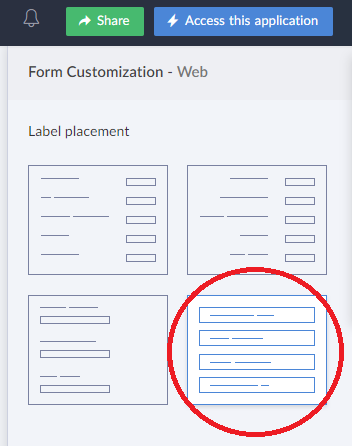
Label Placement #4:
If you've selected the form customization label palcement 4 (where the labels are inside the field):
copyraw
//
// change radio group into tabs
v_Css = "<style>";
v_Css = v_Css + ".zc-Tabs-group{margin-bottom:0;margin-top: 0px;}";
v_Css = v_Css + ".zc-Tabs-label{display:none !important;}";
v_Css = v_Css + ".zc-Tabs-group .choice-table-row{display:inline-block !important;padding:0;}";
v_Css = v_Css + ".zc-Tabs-group .choice-table-cell{padding:0 !important;}";
v_Css = v_Css + ".zc-Tabs-group .choice-table-cell span .customRadio+label{display:none;}";
v_Css = v_Css + ".zc-Tabs-group label.choice-label-text{display:block !important;width:125px;padding:5px;border:1px solid #eee;text-align:center;background: linear-gradient(#fefefe, #efefef);border-bottom:1px solid #eee;}";
v_Css = v_Css + ".zc-Tabs-group label.choice-label-text{-webkit-border-top-left-radius: 5px;-webkit-border-top-right-radius: 5px;-moz-border-radius-topleft: 5px;-moz-border-radius-topright: 5px;border-top-left-radius: 5px;border-top-right-radius: 5px;}";
v_Css = v_Css + ".zc-Tabs-group label.choice-label-text:hover{color:#fff;background: linear-gradient(#006f3d, #ff0);}";
v_Css = v_Css + "</style>";
input.Note_GlobalCSS = v_Css;
- //
- // change radio group into tabs
- v_Css = "<style>";
- v_Css = v_Css + ".zc-Tabs-group{margin-bottom:0;margin-top: 0px;}";
- v_Css = v_Css + ".zc-Tabs-label{display:none !important;}";
- v_Css = v_Css + ".zc-Tabs-group .choice-table-row{display:inline-block !important;padding:0;}";
- v_Css = v_Css + ".zc-Tabs-group .choice-table-cell{padding:0 !important;}";
- v_Css = v_Css + ".zc-Tabs-group .choice-table-cell span .customRadio+label{display:none;}";
- v_Css = v_Css + ".zc-Tabs-group label.choice-label-text{display:block !important;width:125px;padding:5px;border:1px solid #eee;text-align:center;background: linear-gradient(#fefefe, #efefef);border-bottom:1px solid #eee;}";
- v_Css = v_Css + ".zc-Tabs-group label.choice-label-text{-webkit-border-top-left-radius: 5px;-webkit-border-top-right-radius: 5px;-moz-border-radius-topleft: 5px;-moz-border-radius-topright: 5px;border-top-left-radius: 5px;border-top-right-radius: 5px;}";
- v_Css = v_Css + ".zc-Tabs-group label.choice-label-text:hover{color:#fff;background: linear-gradient(#006f3d, #ff0);}";
- v_Css = v_Css + "</style>";
- input.Note_GlobalCSS = v_Css;
Source(s):
- The little bit of my little brain that holds a little information on Cascading StyleSheets (CSS) and Google Chrome's inspect element...
Category: Zoho :: Article: 782


Add comment