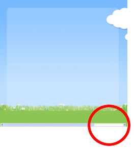
A Client had some clouds on the background of his photoshop file for his website. They were to be positioned in the top right corner with the leftmost tip aligned to the right of a central content section. I separated off the clouds as another div layer, specified the width and height and specified it's left. It caused the horizontal scrollbar which is a bit annoying because you scroll to the right and theres nothing but some background image. Also the footer was at 100% so it got cut off if you scrolled horizontally.
Aim / Objective
To have a background of sky and grass with a centered content section (white semi-transparent layer) of 900 pixels width as shown in the following picture:

And I want the clouds as another layer ontop aligned to the top right:

Tried and failed:
- Specifying the width of the div layer the same as the image and positioning the div. This causes a scrollbar at the bottom.
- Tried different techniques of CSS overflow auto hidden etc. all to no avail.
What worked for me:
- Specify the DIV layer width to be 100 percent of the page.
- Position the module with absolute on your webpage with background (where left is 0 [zero] because your width is 100%).
- Position the background image bearing in mind that your layer is 100% of the viewable browser page.
copyraw
For the semi-transparent background (content section) I used the following CSS:
.templateclouds {
	position: absolute;
	top:60px;
	left:0;
	background: transparent url("../images/soyatemplate_bg_cloudsblurred.png") no-repeat 975px 30px;
	width: 100%;
	height:400px;
	z-index: 10;
}

/* where background breakdown is:
background-image: url("../images/soyatemplate_bg_cloudsblurred.png");
background-repeat-x: no-repeat;
background-repeat-y: no-repeat;
background-position-x: 975px;
background-position-y: 30px;
background-color: transparent;
*/
- .templateclouds {
- position: absolute;
- top:60px;
- left:0;
- background: transparent url("../images/soyatemplate_bg_cloudsblurred.png") no-repeat 975px 30px;
- width: 100%;
- height:400px;
- z-index: 10;
- }
- /* where background breakdown is:
- background-image: url("../images/soyatemplate_bg_cloudsblurred.png");
- background-repeat-x: no-repeat;
- background-repeat-y: no-repeat;
- background-position-x: 975px;
- background-position-y: 30px;
- background-color: transparent;
- */
copyraw
#contentbox {
	position: relative;
	top: 70px;
	width: 900px;
	margin: 0 auto;
	padding: 7px 30px 75px 30px;
	clear: both;
	z-index: 7;
	/* Fallback for web browsers that doesn't support RGBa */
	background: rgb(255, 255, 255);
	/* RGBa with 0.6 opacity */
	background: rgba(255, 255, 255, 0.6);
	/* For IE 5.5 - 7*/
	filter:progid:DXImageTransform.Microsoft.gradient(startColorstr=#ff000000, endColorstr=#ff000000);
	/* For IE 8*/
	-ms-filter: "progid:DXImageTransform.Microsoft.gradient(startColorstr=#ff000000, endColorstr=#ff000000)";
	-moz-border-radius-topright: 20px;
	border-top-right-radius: 20px;
	-moz-border-radius-topleft: 20px;
	border-top-left-radius: 20px;
}
- #contentbox {
- position: relative;
- top: 70px;
- width: 900px;
- margin: 0 auto;
- padding: 7px 30px 75px 30px;
- clear: both;
- z-index: 7;
- /* Fallback for web browsers that doesn't support RGBa */
- background: rgb(255, 255, 255);
- /* RGBa with 0.6 opacity */
- background: rgba(255, 255, 255, 0.6);
- /* For IE 5.5 - 7*/
- filter:progid:DXImageTransform.Microsoft.gradient(startColorstr=#ff000000, endColorstr=#ff000000);
- /* For IE 8*/
- -ms-filter: "progid:DXImageTransform.Microsoft.gradient(startColorstr=#ff000000, endColorstr=#ff000000)";
- -moz-border-radius-topright: 20px;
- border-top-right-radius: 20px;
- -moz-border-radius-topleft: 20px;
- border-top-left-radius: 20px;
- }
Category: Cascading Stylesheets :: Article: 347


Add comment